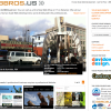
Our new Drupal 7 site: this one for fun.
Tags:

We committed to Drupal as our development platform at Drupal 4.7.
We had built BBros.us in 4, 5, 6 and now 7.
Here is my reflection on our new site.
Goals:
- We wanted an updated and clean design that made use of our existing colors and logo.
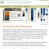
- We wanted a personal site that reflected our small team and technical background. ("Human Scale Web Development")
- Simplify and Focus the site; for prospective clients, for current clients and for our own maintenance.
- Add some fun features to show off our development capabilities and enjoy ourselves building the new site.
- The last site was in D6. We have moved to D7 for new clients and our own site should reflect that.
- The design was looking dated, time to get fresh.
- The site had entirely to much copy (137 pages indexed by Google).
Often we council moderation for our clients with elaborate web plans, as many an added feature can go unused. We had fallen prey to this in our D6 site; we had pages for every web package and service, press releases, support documents, links, portfolio items and more. Trying to keep this all updated was a waste of time and to top it off it not save us any effort making sales or in educating existing clients.
So we start:
We brainstormed and developed a simplified skeleton of the site on our development server. (FYI. We start with base install for all our new sites. We maintain this install and it contains all our current favorite modules, functionality, content types, blocks, views, forms, configurations, user levels and example content. Starting w/ this base install we then prune it back for our needs.) This time we kept just a few central pages (32 vs. 137), an easy to update portfolio content type, a couple Webforms and fun lil slideshow content type (you'll see why its fun). We also defined some key blocks and menu items. We did not make an effort to migrate content as we were going to lose most of it and rewrite the rest.
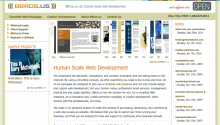
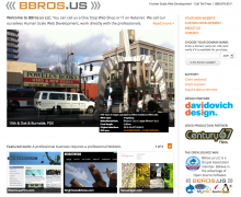
Dovetailing with the site outline we started a new design. We wanted to modernize the design, keep our logo, highlight our partnerships, reflect our technical background and come across more personally. Our tagline is "Human Scale Web Development". From this our design partner gave us a simple easy to implement design and dreamed up our central technical feature.
The basics were out of the way after a couple iterations.
What is so fun and personal about the site?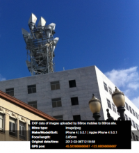
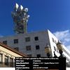
#1) To start with we added a slideshow content type that is visible on the front page. The slideshow's image and title is created with the Feeds module by email submitted from approved users and retrieved using the Mailhandler module. These images are also parsed for EXIF data via the Exif module that is then displayed within the front page slideshow. Direct from our BBros smartphones to our BBros website, I think that's fun and personal (heck w/ one click you can Google map my Timbers seats).
Timb plans on a more detailed write up on Baxwrds about implementing this feed functionality.
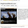
#2) Another feature that I think is cool and makes it easy for us to update and add portfolio items is that we added the capability for the site to grab its own screenshots. This saves us time and makes the portfolio much easier to maintain.
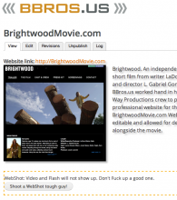 The way to make this happen is a little hackish, an answer on hand from another project. I added a block to our Portfolio node type that displayed to the Administrator role. This block is a form that validates and then calls a shell script to use CutyCapt, along w/ a headless XServer & WebKit set up on our Ubuntu machine, to capture a web page image and then resave the node with this new image.
You don't have complete control of the aspect ratio and may not always capture the screenshot you wanted.
Additionally I used the Weight module to create an admin view of portfolio items with easy to use drag and drop ordering.
#3) Another unique feature we have had in the past is a Domain lookup block. This block, another form, validates the user entry and then uses the PHPWhois library to validate whether a URL is available for purchase. I have thought that the PHPWhois library would be a good library to develop a module around.
#4) I have to give a shoutout to the very useful Webform module. We replaced our support document library with one simple Webform set up as a support ticket. To do this we first presented it that way, added some dependent fields to make the form more responsive. We then added administrator only fields to mark a ticket's state as well as to keep notes, creating a simple shared ticket management queue.
I hope you find this interesting. Please leave feedback on the above and/or the site in general. Thanks to the Drupal community building sites in Drupal 7 is funner than ever.



 BeatnikDude is an individual member of the Drupal Association.


